

Anne Isabella

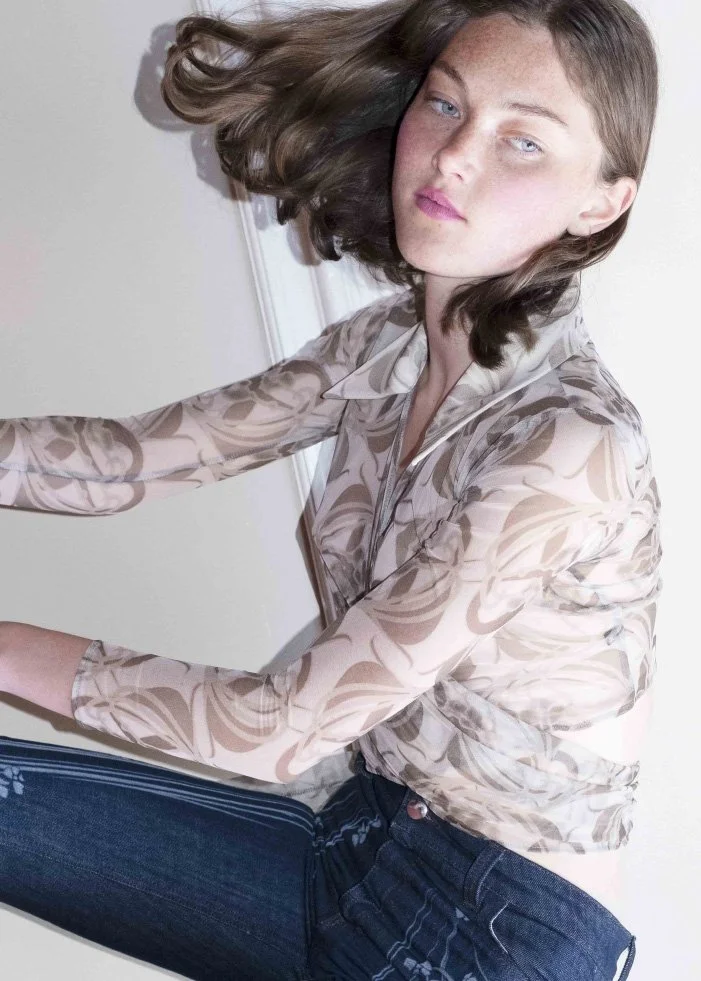
Anne Isabella’s Spring Summer 2022 Collection is a revival of art nouveau, psychedelia, and retrofuturism. With the architecture of Victor Horta featured on the collection’s mood board, the pieces collide to unveil a tension between historical contradicting elements; the sustainable production of her pieces with the creative influence of the industrial 60s. Opulent surrealist patterns are Anne Isabella’s signature print, harmonized together with nostalgia, intricate seaming and textural rawness.
After launching the brand in 2020, Anne is notorious for taking familiar silhouettes and elevating fabrics to mirror symbolic compositions. By meshing her hallmarked optical print with classic styles of the 70s – whether it’s through a-line skirts or tailored jackets – Anne affirms a new language of reinvention to reveal timeless motifs. Enamoured by the optimism and community of the 70s, Anne’s pieces manifest a sense of dimensional freedom that activates a raw, yet polished aura.

What inspired you to explore and pursue this avenue? Give us a brief history of your start in fashion.
If we go right back to my school years, it was through drawing and an encouraging teacher that introduced me to fashion illustrations. What I liked about fashion then and still value is the opportunity to work across different disciplines. I moved to London in 2011 and started with a BA in print design where my drawing skills were easily translated at CSM, then right after graduating with the MA in womenswear I worked at Courreges. In 2020 my partner Max and I set up the label, little did we know the pandemic was around the corner!

How is the ethos of sustainability emulated into the final product? What practices do you implement to fulfill this philosophy?
I try to be conscious of both the environmental and social impact of the label in the design process as well as production. That means when you buy one of my pieces, we have done our best so that the fabric and fusing, all the way to the final fastenings are GOTS-certified, upcycled or deadstock. We also take great care in the production environments that we work in, producing and printing in European GOTS factories. Of course, there is more we can do, but we set ourselves this standard. I believe that this is important because, despite a lot of pronouncements, the industry still needs brands to demonstrate that design doesn't have to be compromised by sustainable practices.

Explain how you channel the 60s and 70s into your designs. What elements of those eras do you try to incorporate into your garments?
I really enjoy taking something that is well known and giving it a new twist. So at the moment, that’s what I’m doing by taking recognizable silhouettes, A-line skirts, tailored jackets and coats as well as denim pieces. When I combine those shapes with my optical prints, for example, I’m trying to change the language of those pieces, so they find new relevance. On another level, I’m really drawn to the sense of optimism and community that existed during that time, despite a lot of turbulence. In that sense, I want my work to bring a feeling of light-heartedness and positivity!
Share with us the creative process behind SS22. What was on your mood board?
For SS22 I was looking at the art nouveau revival during the 1970s, which you can see in a lot of designs from that time. The print shapes draw references to the organic shapes of Art Nouveau - florals and tendrils, which I combined with more psychedelic stripes and neo-sportive details in the cuts. My mood board had a lot of architectural elements and references such as Victor Horta. I grew up in Belgium so I have always had a curiosity about this type of architecture. The organic approach really stands out. The art nouveau revival of the 1970s is pretty niche, so it was hard to research it in-depth, but we took a really nice visit to the Bröhan Museum in Berlin where they had an exhibition by Luigi Colani. They mirrored a lot of his designs with Art nouveau items which were fascinating. Eventually, what was interesting to me was that Art Nouveau was a response to industrialization and mass production, so I tried to use these organic elements, but then to laser it on denim and create tensions between the two historical references.

What drew you to vibrant prints as your signature pattern?
It really emerged during MA. These things always happen in many steps. I was researching archetype garments to rework. I was distorting garments on a scanner and trying to gain a new interpretation of those pieces. A more organic-looking one. One of those pieces had stripes. Most of the pieces in that collection were a reconstruction between the original silhouettes and the new information the scanner had created (melting buttons and wavy hemlines). But for the print, I eventually decided to keep the garment as simple as possible and let the print be the melting element.

How have you evolved as a designer since your first collection?
So much has happened! Firstly, in my early student days, I wasn’t as aware of sustainability in fashion but when I started my label I decided to make it an integral part. It hasn't been an easy option and limits my outcome a lot, but sometimes limitations can also lead to new results. Visually, I evolve every season, and the research also moves with me. I like to keep core references every season, but I also love to explore new techniques and approaches. These things always take time, but I am expanding into presentations and videos this season, so the brand identity is also slowly going to be introduced into other dimensions which I am really excited about.

words CAELAN MCMICHAEL
What to read next


