Diagrams at Fondazione Prada

We are speaking about data, about visual graphs: about diagrams. Infographics (or dataviz), in their analog version, are tools not only for analysis but above all for constructing thought, propaganda, or struggle. This is the central theme around which Diagrams, the exhibition by Fondazione Prada, is built. It takes place in the Venetian venue of Ca’ Corner della Regina (the palace where the almost unsurpassable Monte di Pietà exhibition was installed, which we discussed at this link), from May to November 2025, on the occasion of the preview of the 19th Architecture Biennale. Diagrams was conceived by the studio AMO/OMA and is the result of extensive research curated by the studio founded by Rem Koolhaas, in collaboration with architect Giulio Margheri and with the scientific contribution of Sietske Fransen, head of the Max Planck Research Group at the Bibliotheca Hertziana.


““The strength of the diagram lies in its apparent neutrality. Often devoid of ornament, scale, and context, diagrams imply knowledge without the burden of explanation. Their authority comes from agreement rather than from discussion.” ”


Diagrams: the apparent neutrality of diagrams and data as material.
““This exhibition is not a history of diagrams. Nor is it a showcase of OMA’s diagram production. It is an archive of thought and spatial organization. The result of our proposal is an open field of activity and functioning, with content presented according to nine topics and contemporary ‘urgencies.’””
Diagrams presents a historical survey of 300 analog graphs and infographics, books, rare documents, and publications, dating back to the 12th century and up to the present day. It allows us to trace the evidence of the transversal and diachronic nature of diagrams, enriched by the publication edited by Irma Boom.
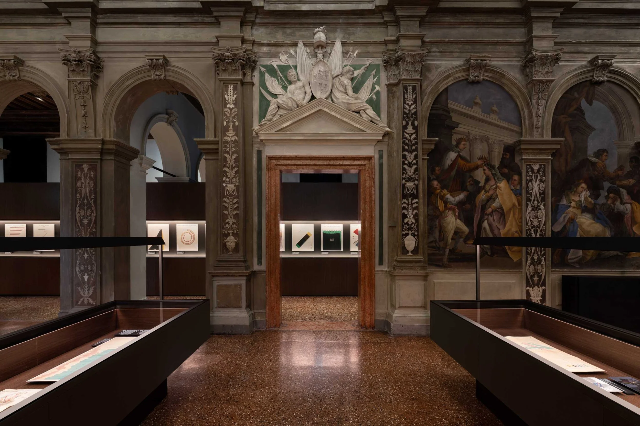
The exhibition path is structured according to a rigorous logic, diagrammatic in itself, across the two floors of Ca’ Corner, with a compass (a meta-diagram) on the ground floor that guides us in understanding the project and the research methodologies that preceded it. On the upper floor, a series of identical showcases, composed of niches and staggered reading levels, organize all the materials into themes, articulated in subthemes, starting from “contemporary urgencies”: Built Environment, Health, Inequality, Migration, Natural Environment, Resources, War, Truth, and Value.
The architecture of data and information: the Diagrams project
Prada’s proposal for this year, which we recalled staging art as a critique of the economic and capitalist system starting from the concept of “debt” in Monte di Pietà 2024, continues with the intention of using the artistic display to question reality through form, content, and data. In Monte di Pietà, the exhibited works reflected on material and immaterial values, evoking memories, traumas, and ideological tensions. The exhibition used the language of art to stage a system of values: money, power, guilt, redemption.
In contrast, Diagrams adopts an apparently opposite language: that of abstraction, of analysis, of the coding of visual thought. The exhibition focuses on the diagram as a conceptual tool, not only of representation but also of production of meaning. Here the attention shifts from symbolic content to the architecture of information, to the structure of ideas, to the way in which data, relationships, and flows are visualized and therefore understood. The single datum is used as raw material from which to derive meanings, visions, narratives.
“The diagram is the possibility of the fact, not the fact itself”: starting from this assumption by Gilles Deleuze, the exhibition invites reflection on the diagram form as a means to create meaning, to shape or influence thought or, in opposition, to create propaganda and persuasion and convey mistaken, harmful, or politically aligned ideas masked as scientific data. OMA, through the study and the display, juxtaposes a wide and deep selection of diagrams from 1200 A.D. in a minimal, deliberately decontextualized way, which hammers both their value and their risk. Quoting Koolhaas, “this means that diagrams not only exist by default in any new medium, but can also be applied practically to any area of human life,” omnipresent across the geographies and times of humanity.

Koolhaas, OMA and diagrammatic culture
Rem Koolhaas is a forerunner of diagrammatic culture: while in the artistic field the diagram is often explored for its conceptual and semiotic power, Koolhaas uses it as an operative device that translates data into spaces and functions. In both cases, the diagram becomes a bridge between abstract and concrete, between thought and form. Koolhaas warns about the potentially persuasive function of what appears in the diagram as “scientific data”:
“From my point of view the diagram is a tool that has always existed. For example, in the early stages of our research we found three-dimensional diagrams made in South Africa around 40,000 B.C. and maps of the Greenland coast carved in wood on the island of Ammassalik. This shows that it is a durable form of communication that adapts to whatever medium exists at a given moment. And, regardless of the medium, the diagram always fulfills didactic (explanatory) or suggestive (persuasive) functions.”
In his architectural theory, Koolhaas is not new to the minimal form of a diagram, an example in his proposal to dismantle architecture into its fundamental components and analyze them one by one, as one would do with a language, to return to the basic elements that constitute every building: the door, the window, the corridor, the ceiling, the floor, the elevator, the staircase, the bathroom, etc. As he states, “We want to strip architecture down from the narratives that obscure what we are really dealing with.”
For example, in the famous book S, M, L, XL (1995), Koolhaas and OMA use numerous diagrams to describe, more than the final appearance of buildings, the underlying mechanisms (functional, social, economic, cultural), glorifying the reality of “processes” through a free fall into the space of typographic imagination. The diagrams in Koolhaas are often performative, meaning they do not illustrate something that already exists, but generate design ideas, and may contain real data or be hypothetical tools. Another example: with OMA/AMO, Koolhaas explored the architecture of information: think of editorial projects or the design of exhibitions such as Elements of Architecture at the 2014 Venice Biennale, based on an encyclopedia of data and analysis on the components of architecture.
““The diagram not only exists by default in any new medium, but is applicable to any area of human life. Fashion, religion, as well as the history of social inequalities, can all be interpreted in diagram form. I deeply value these interdisciplinary aspects of the diagram, its invariable attribute. The fact that it is independent of language makes it one of the most effective forms of representation.””
A large meta-diagram: the exhibition display by AMO/OMA
A distinctive element of the exhibition is a large display designed by AMO/OMA, which introduces the show with a meta-diagram representing the very structure of the project. This approach reflects the intention to examine diagrams not only as tools of communication, but also as critical and reflective objects.
OMA (Office for Metropolitan Architecture) is an international research office founded in London in 1975 by Rem Koolhaas, Elia Zenghelis, Zoe Zenghelis and Madelon Vriesendorp. AMO, a research and design studio, applies architectural thinking to other domains. The work of OMA and AMO, along with Koolhaas’s architectural thinking, aims to broaden the field of architecture.
The assumption: are data neutral?
A historical genealogy of data visualization
Are data neutral? No. Numbers taken in themselves might be, but their aggregation is not. Diagrams starts from this non-obvious reflection and examines diagrams as tools of visual communication by investigating the role they have historically played and their impact on contemporary culture. To describe the project, it is important to clarify that the diagram is mistaken in its presumption of objectivity, masked as data. Therefore, diagrams are not neutral tools.
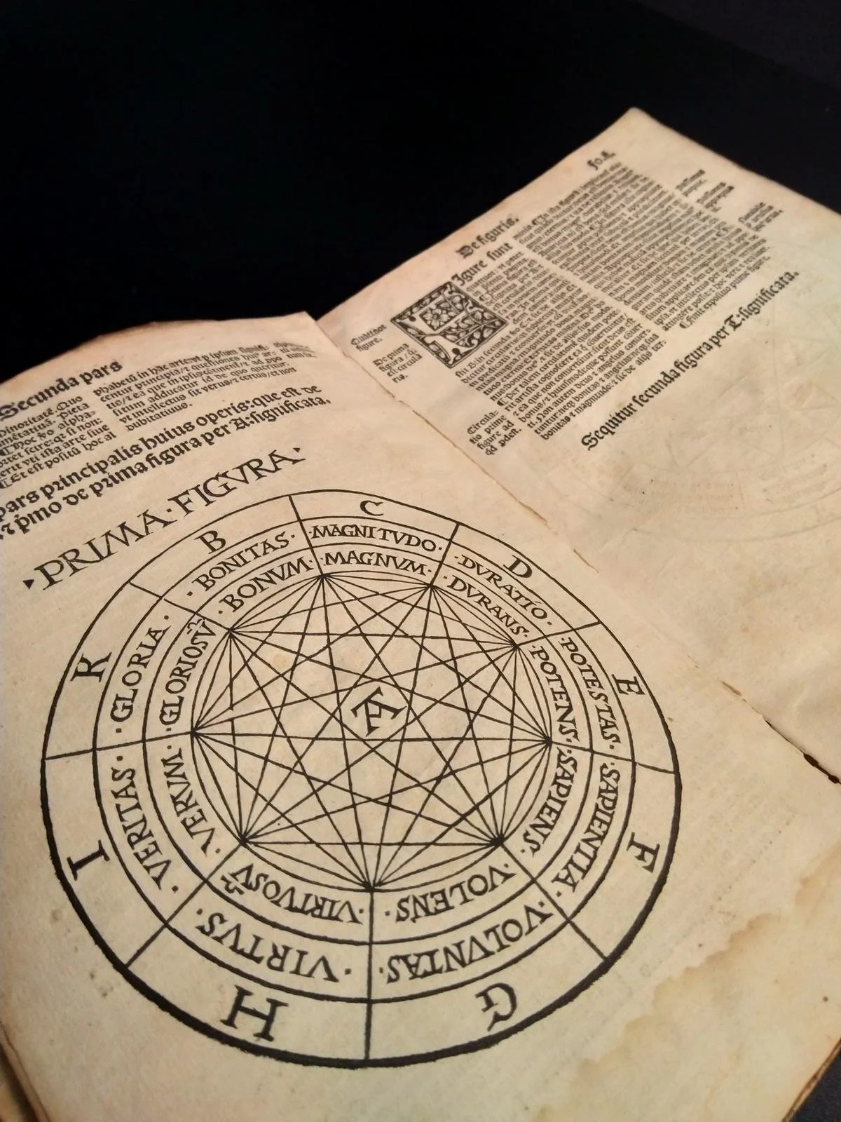
The genealogy of visualization crosses centuries, media, and cultures. At the origin of infographic visualization, we find the Tactile Maps of Greenland (10th century – 19th century), among the earliest examples of “visualization of territory” made by the Inuit of eastern Greenland. Not drawn maps but tactile objects, carved to follow the coast, inlets, fjords. They were used to navigate and orient oneself in the frozen landscape. In the medieval world, especially in monastic manuscripts, the first abstract diagrams appear, not connected to territory, such as cosmological diagrams and genealogical trees. One example is found in the famous diagrams of Ramon Llull (on display is the Diagram of the attributes of God, from 1517) which aimed to show the connections between theological concepts, God, the order of knowledge, divine logic.
Modern infographics originate with the Enlightenment, and from the first pre-modern examples up to central figures such as Playfair (on display at Prada is his “Universal commercial history from 1500 to 1805”), Charles-Joseph Minard, Du Bois, Humboldt. It is in the 20th century that the diagram begins to be used as a social and political tool thanks to W.E.B. Du Bois and Florence Nightingale. It is in fact at the beginning of the century, with the advent of new printing techniques, the rapid spread of education, an interest in the natural sciences, astronomy, geography, and religion, and with the possibility of spreading printed knowledge beyond the usual cultural and intellectual elites of the time, in a horizontal way. Diagrams emerge as explicit tools of meaning-making and sometimes help build consensus often rooted in religious, political, or philosophical traditions.
The nine main themes and starting case studies
The exhibition layout by AMO/OMA is conceived according to the principle of Contemporary urgencies across nine main themes: Built Environment, Health, Inequality, Migration, Natural Environment, Resources, War, Truth, and Value. Each theme is documented within a series of display cases arranged in parallel in the central hall of the first floor of the building and expanded upon in side rooms. Each “urgency” is further developed through Subthemes: sustainability, body, world between elements and calamities, food, war strategies and atomic bomb, religion, astronomy, history, fluctuation of the value of money. Very interesting are the initial case studies and the in-depth displays dedicated to some individual authors, milestones in the study of diagram-form and data visualization.
Critical cartographies and data representation: some of the pioneering studies in Diagrams
Some of the case studies on which the exhibition is built (and certain in-depth sections in the subcategories) are the founding figures of the diagram and of critical cartography as we understand them today.
One of the most significant authors featured in the Diagrams exhibition is Philippe Rekacewicz (born in 1960), a French cartographer, geographer and journalist known for his work at the border between geography, art, activism and political representation. His cartography is militant, subjective and poetic. A key figure in the contemporary scene of critical cartography, Rekacewicz argues that every map is a political construction, and therefore an act of power. He also contributes as an author to the publication accompanying the exhibition: the illustrated book graphically designed by Irma Boom, with an introduction by Miuccia Prada and nine essays by international scholars and designers.

Another name is William Playfair (1759–1823), considered the father of modern statistical graphics. He was a Scottish engineer, economist and inventor, known especially for having invented three of the most common types of data representation: line chart, bar chart, and pie chart.

Charles-Joseph Minard (1781–1870) was a French civil engineer and one of the most influential pioneers of data visualization, known for his extraordinary ability to combine quantitative precision and narrative clarity in his graphic representations. His masterpiece: the map of Napoleon’s Russian campaign (1869) is considered by many as the best infographic ever made.

Considered one of the founding fathers of the modern science of geography and ecology, Alexander von Humboldt (1769–1859) was a Prussian explorer, geographer and scientist. His figure is essential to understanding the origin of systemic and interconnected thinking: he was among the first to conceive nature as a complex and interrelated system, anticipating ecological thought. He began using charts, maps, altitude profiles and comparative diagrams to represent the environment in a visual and multidimensional way.

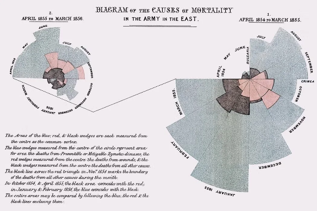
Also fundamental and very interesting is the case study of Florence Nightingale (1820–1910), English founder of modern nursing. She shows how clear visual communication in the medical field brought about significant legislative progress aimed at improving sanitary conditions. Nightingale’s example introduces the study of an important corpus of documents and manuscripts related to scientific topics, drawn from ancient cultures around the world. The section dedicated to her leads us to reflect on the intersection between scientific progress and care of the individual, of well-being and health. During the Crimean War in the mid-1800s, Nightingale developed her pie chart, known as the “Coxcomb.” It is one of the earliest examples of data visualization. Each slice represented a month, divided into colored sections to indicate the different causes of death, with three different colors. This chart showed that the majority of soldiers were not dying in combat, but due to infections and poor sanitary conditions, thus influencing health reforms.
“The Exhibit of American Negroes”: the prototype of data activism and the section dedicated to William E.B. Du Bois
The starting point of Diagrams is the work of W.E.B. Du Bois (1868-1963), African American sociologist known for his studies and infographics on Black communities in the United States between the late 19th and early 20th centuries. The charts created for The Exhibit of American Negroes, presented at the 1900 Paris World’s Fair (over 60 graphic plates), serve as the initial reference.
In 1900, Du Bois led a group of students and collaborators at Atlanta University to produce a series of pioneering infographics, displayed at the Paris World’s Fair, within a section dedicated to the African American community, marking a crucial moment in the evolution of mass communication. This case study sheds light on how infographics addressed, communicated and often omitted certain issues related to social justice, racism, and the representation of ethnic and religious minorities.

Du Bois was among the first to understand that visualizing data was a political act, not neutral: data, then, could be a means of emancipation. In this case, the infographic becomes a critical device: a way to make injustice visible, to educate, to change collective perception. Among the plates shown at Ca’ Corner are his remarkable graphic works on illiteracy from 1900, “Social analysis of African Americans in Georgia,” “Estimated value of furniture for African American homes and kitchens in Georgia.”


As Koolhaas states,
“Complex ideas are almost an intellectual pleasure, sometimes even artistic, and they have become a driving element toward the goals we wanted to reach. In this sense, diagrams helped us a lot. Through research and their creation, we tried to give shape to a space or define another architecture that required many reasonings and articulated considerations. We wouldn’t have even approached this goal if we hadn’t discovered a series of diagrams. The role of diagrams was crucial at the time, because we needed material proof to show that what we wanted to realize was possible. Today I might be in a different position where I do not have to prove that things are possible, and certainly this changes the nature or role of diagrams in my work. However, even today diagrams remain an important part of my repertoire.”
Visual product, form of thought. Diagrams’s minimal and non-ideological approach.
While rhetoric convinces through emphasis and sequence, diagrams do so through structure and proximity. Data diagrams rely on abstraction and seek to transcend historical conventions in search of universal readability which, however, as the exhibition itself tries to affirm, are not neutral, but rather always clearly aligned.
As read from the presentation written by OMA:
“Many diagrams do not convey what is already understood, but rather communicate assumptions. They illustrate ideas that still need to be verified: territories before being explored, bodies before being dissected, and stars before being observed. Because the volume of information with which we interact becomes inhuman in its scale, we depend more than ever on diagrams as tools to visualize categories, hierarchies and dependencies of the data that surround us.”
Fondazione Prada offers a fascinating reflection on the role of visual information, abstraction and analysis, and does not hesitate to highlight how diagrams can be ambiguous tools for distorting a narrative, thanks to the disruptive power of big data and a fragmented communication landscape conveyed by social media and online platforms. In the era of big data and algorithms, Koolhaas’s diagrammatic approach and reflective projects of this kind are especially necessary in the artistic and creative fields, to address themes increasingly less conceptual and more social, and, consequently, topics for shared discussion. Reflecting on the future of diagrams, while artificial intelligences act on our policies and on peace and war (examples are needless), gives a new meaning to the concept of display and “exhibition” in art, which (as this year’s trend) makes a precious historical archive its rich exhibit, and a recalibration of the concept of diagram itself, human products conceived to make sense of the world, as collective and universal visual intelligences.
An exhibition that does not aim to glorify, that does not want to adorn itself with adjectives. A dignified exhibition, silent, minimal in its own way, which is above all a language of awareness.


Words by MATILDE CRUCITTI
What to read next